Demo · B1
A website for a dental practice, built so a nervous stranger asks for an appointment.
Five pages, no photographs, and one request form that asks for nothing about health.
Someone choosing a dentist is often afraid, and a page that sells to them makes it worse. This one takes things away: pale colour, one typeface family, one coloured button, and a drawn plan of the way in instead of a photograph of a smiling model.
Buy this one and the same five pages are written for your practice, your team and your fees.
Tern Yard Dental, its four people and its fees are invented, and its phone number and address belong to reserved ranges, so they reach nobody. The form sends nothing.
Built as
Multi-page
€1,000
Up to 5 pages · in 4 weeks · 2 rounds
Standard price €1,000, no increases planned
See all three plansOpens the finished site, with our label across the top.
Judgement
What this build demonstrates
Each treatment is a row of facts
What it is, how long to allow and what it costs here, set in a table that stacks to label and value on a phone. A nervous reader gets numbers, not adjectives.
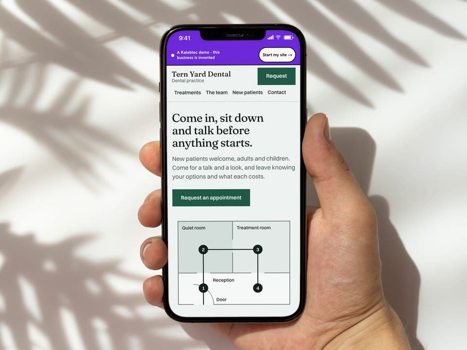
The first screen is a plan, not a photograph
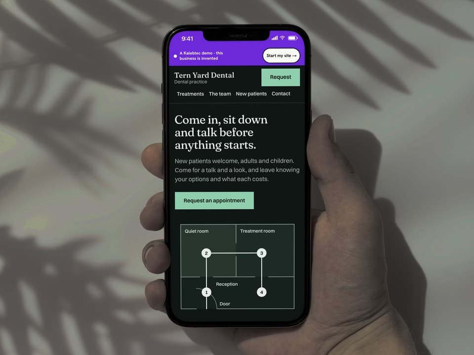
The way in is drawn: door, reception, quiet room, treatment room, with the route marked. The four stops are also the four steps of a first visit. It shows what the visit is like without a stock image.
The form asks for nothing clinical
A name, a way to reach you, what the visit is for and a time. There is no box for symptoms or history, and the form says health is discussed in person. The page collects no health information.
One coloured object per screen
Green appears on the request button and nowhere else. Everything else is ink on pale paper, so the one action is the only thing asking for attention.
Fit
The kind of business it suits
A practice that wants new patients to ask for a first visit.
- Independent dental practices
- Orthodontic and hygiene practices
- Opticians and hearing clinics
- Physiotherapy and osteopathy clinics
A poor fit for a practice that needs patients to pick a slot straight into its diary or fill in a medical history online. That is a different build, and we would say so and point you at the tool you already use.
Your site
Yours would be built the same way
Same price, same week, drawn for your trade. You see five design directions first and pick the one that ships.