Demo · C6
A website for a software product - built to explain one thing and earn one sign-up.
One page, one screen of the product, and one button.
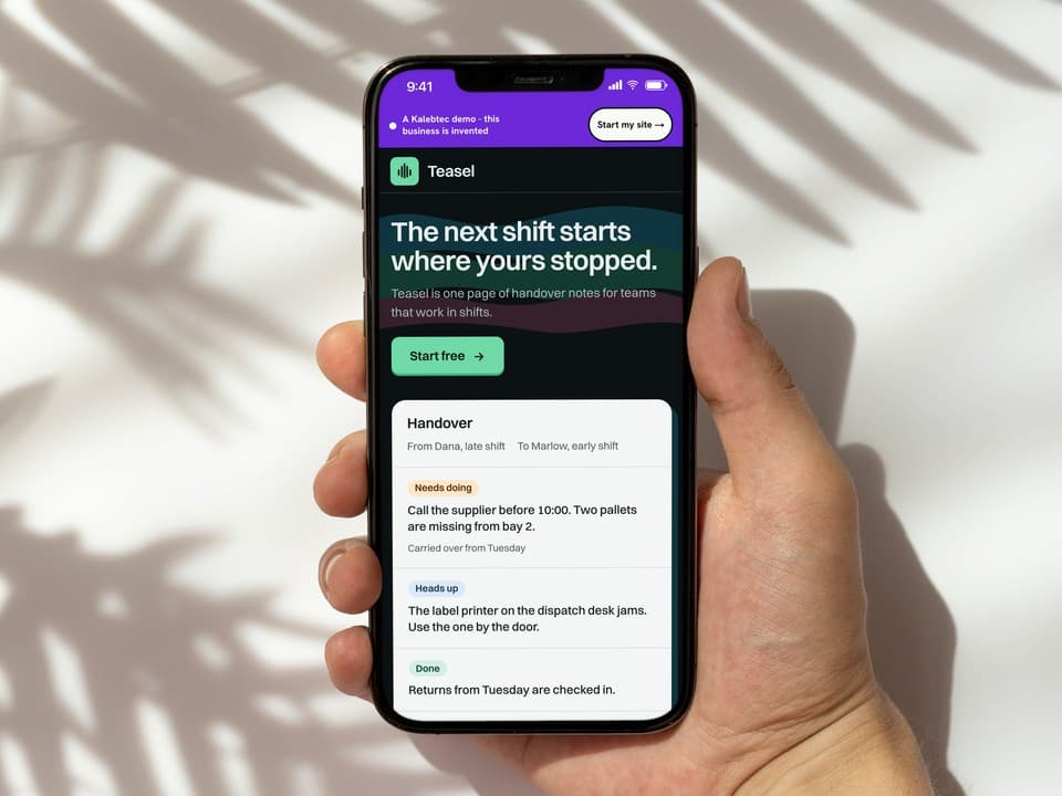
A visitor decides quickly whether a product is for them. This page spends that time on a single screen of the product, drawn as live text, with the sign-up button in reach all the way down.
It is a finished one-pager you can open and press. Buy this one and we build the same page around your product and your sign-up address.
Teasel, Sedge Works and the $9 are invented, and the sign-up address leads nowhere.
Built as
One-pager
€500
1 page · in 1 week · 1 round
Standard price €500, no increases planned
See all three plansOpens the finished site, with our label across the top.
Judgement
What this build demonstrates
The product's own screen is the only bright object
The page is near-black, with three flat colour bands behind the headline. The one pale surface is the product, a handover note, and it is the largest and lightest thing on the page, so the eye has one place to land.
One screen, as text you can read
One handover, set as real text, shows what the product does in the time it takes to read three lines. A search engine or a screen reader can read it as well.
It sets the product beside what it gets mistaken for
A rota, a chat and a task manager are the things this product gets mistaken for. Three short lines, one for each, place it beside them.
The button hands off to the product's own sign-up
One button, repeated at natural points, goes to the product's own sign-up. The price is a line of information.
Fit
The kind of business it suits
One product, and an account that lives elsewhere.
- Apps and software tools at launch
- Coming-soon pages that hand off to a waiting list
- Newsletters and member communities with their own sign-up
- A course or a single service with its own sign-in elsewhere
A poor fit for a product that needs a page for each feature, a documentation section or a blog. One page runs out of room there, and we would say so and point you at Multi-page.
Your site
Yours would be built the same way
Same price, same week, drawn for your trade. You see five design directions first and pick the one that ships.